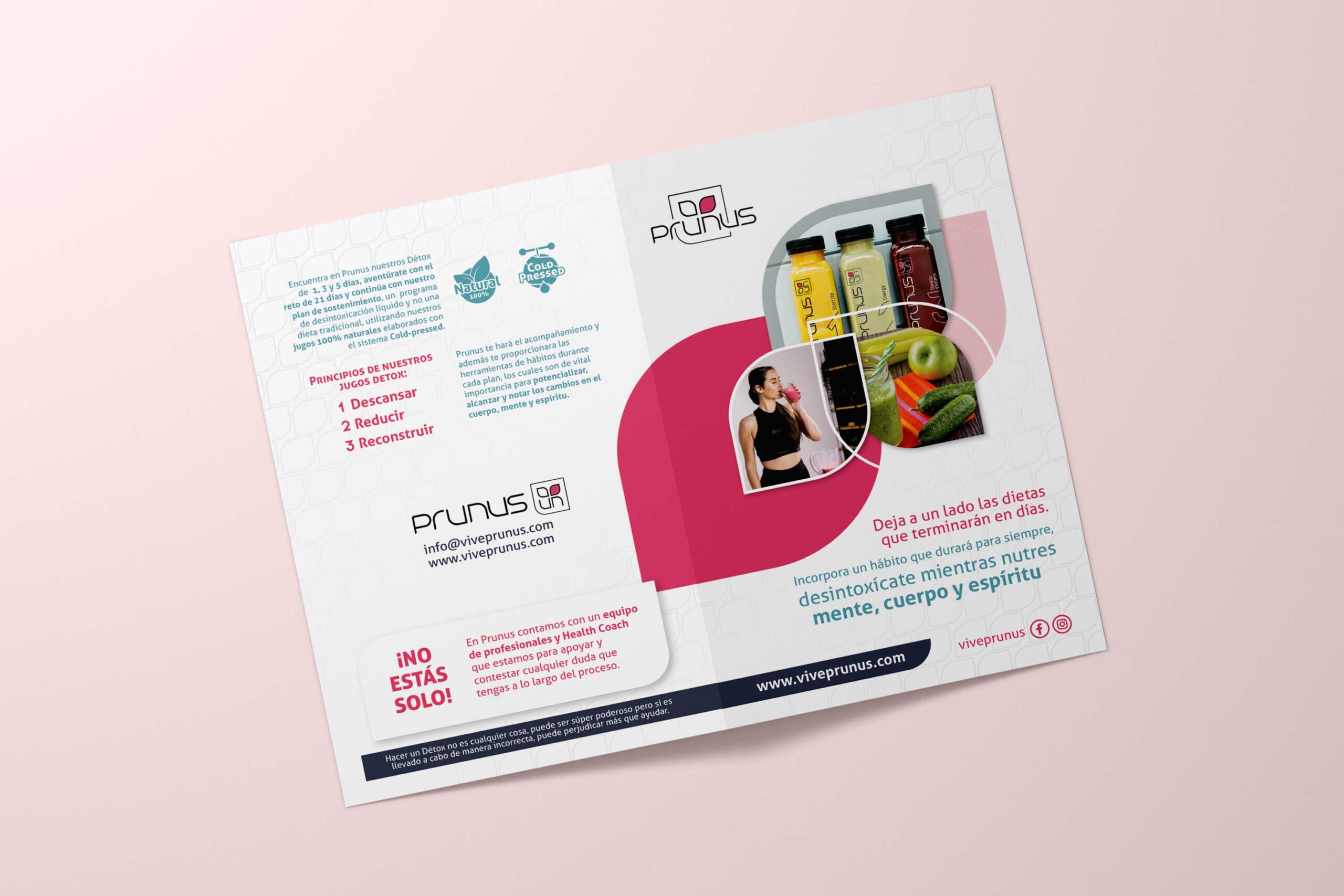
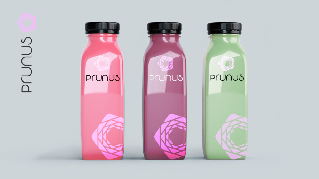
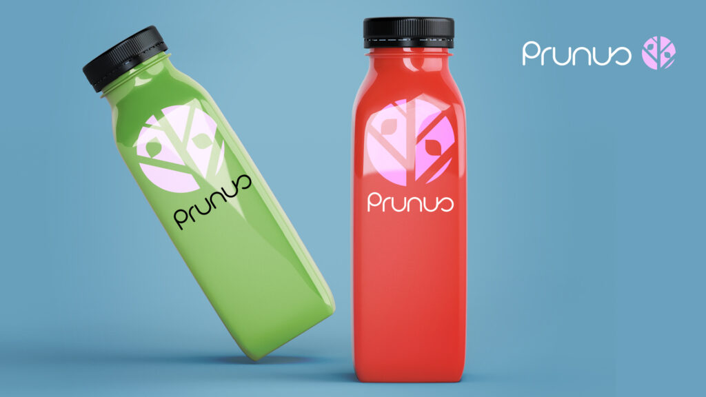
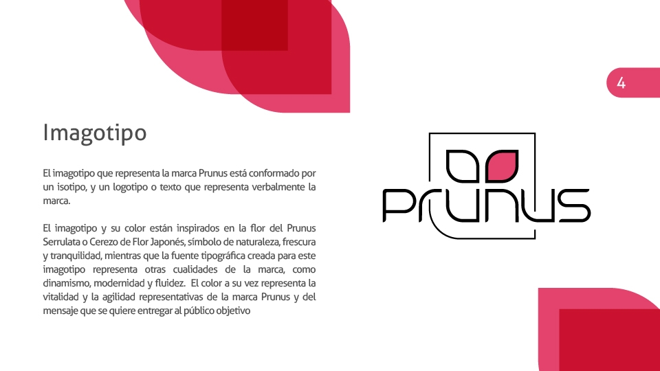
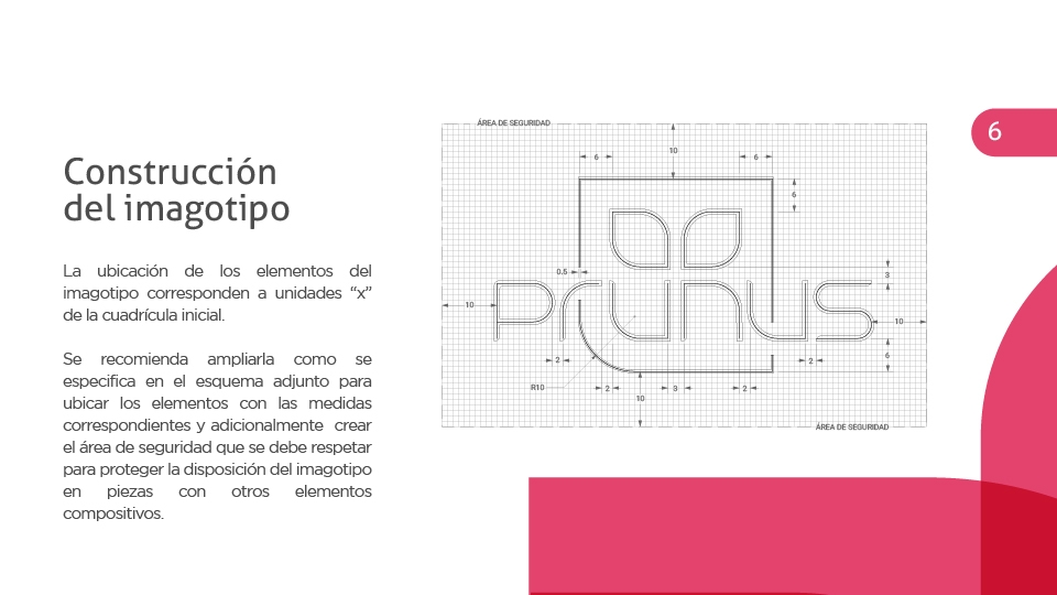
The entire design concept created for the brand is inspired by the Prunus Serrulata or Japanese Cherry Blossom flower, a symbol of nature, freshness, and tranquility.
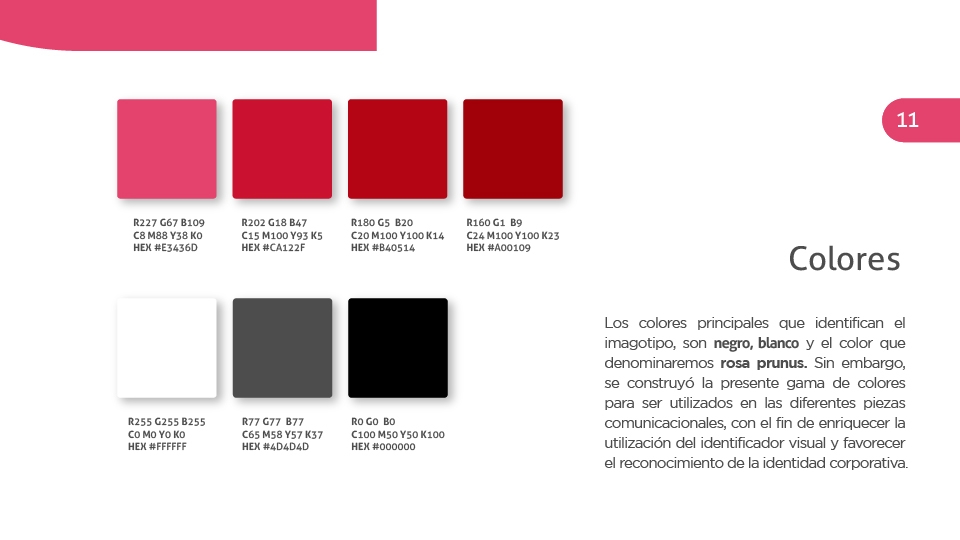
A typeface was also developed for this logotype, which seeks to represent other brand qualities, such as dynamism, modernity, and fluidity. The color, in turn, represents the vitality and agility that Prunus aims to convey as a message to its target audience.


