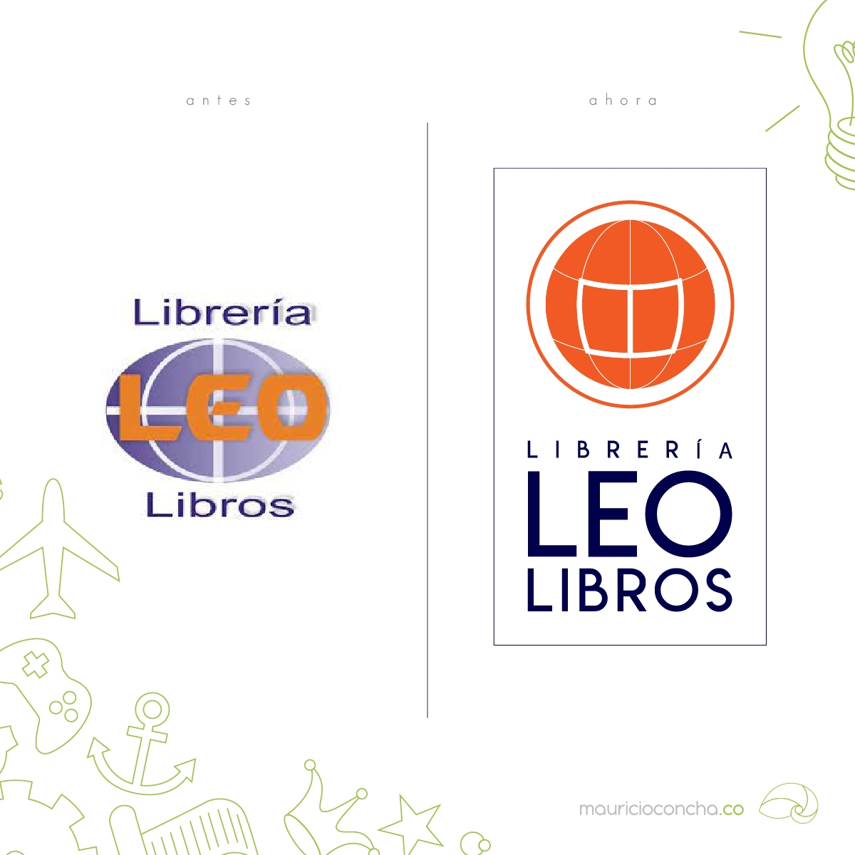
It's a pleasure for me to be able to help institutions create and evolve their corporate identity, as in the case of the evolution of the logo of a company so beloved by all Manizales residents, such as the Leo Libros Bookstore.
In the case of this logo redesign, the client's requests were taken into account, regarding the preservation of important elements that make this company easily identifiable and so memorable in the environment in which it operates, highlighting the word LEO, linked to the verb "to read" but also to the name of its owner, while retaining the globe, which represents its slogan "A world of knowledge at your fingertips." Additionally, although the original colors had to be preserved, the tones were changed to make them easier to replicate in different digital media, giving greater priority to orange than blue, in order to differentiate itself from the colors used by its direct competitors.